I turn ambiguous problems into clear product bets.
I spend most of my time before the problem is defined. Consumer discovery at Amazon, enterprise systems at Upland. Different enough that what transfers between them had to be earned.
AI handles scaffolding. I don’t use it to frame problems or decide what a user meant. Those are the two places where being wrong is expensive and being fast is worthless.
Work
Selected case studies
2023E-commerceDiscovery+$10.9MM GMS · 28-day A/B
Amazon : Product Finder
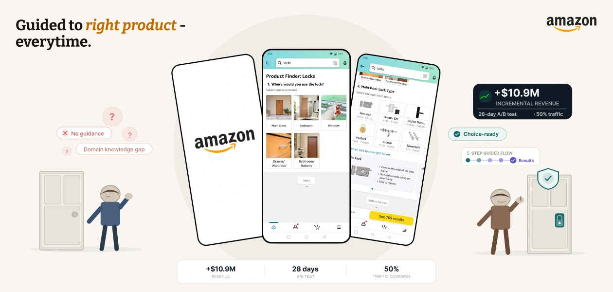
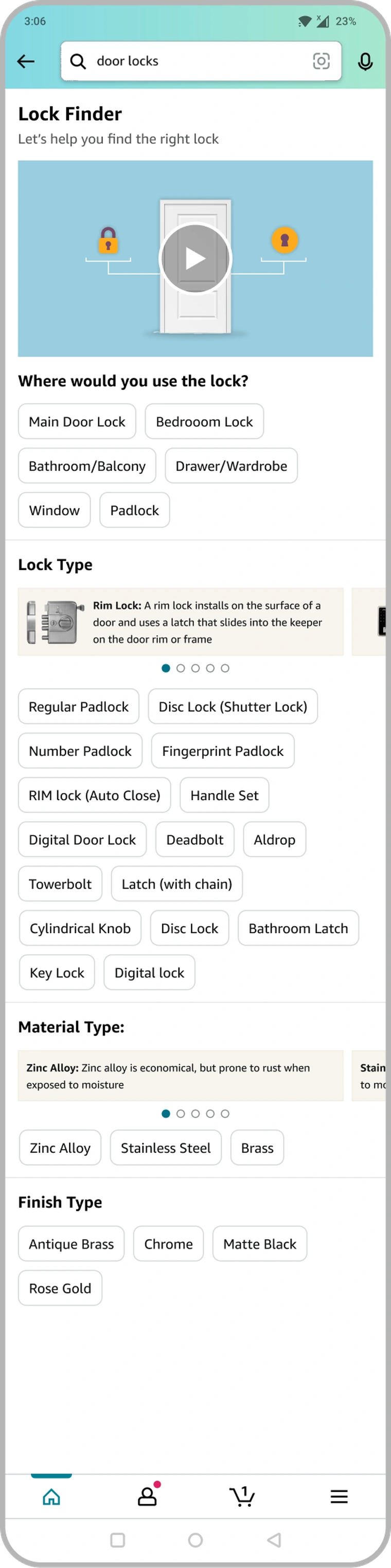
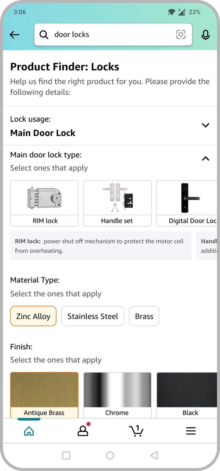
Customers knew the job: "secure my front door." Not the product. A four-question flow translates that intent into the vocabulary the catalogue understands, turning a wall of results into a short, confident shortlist.
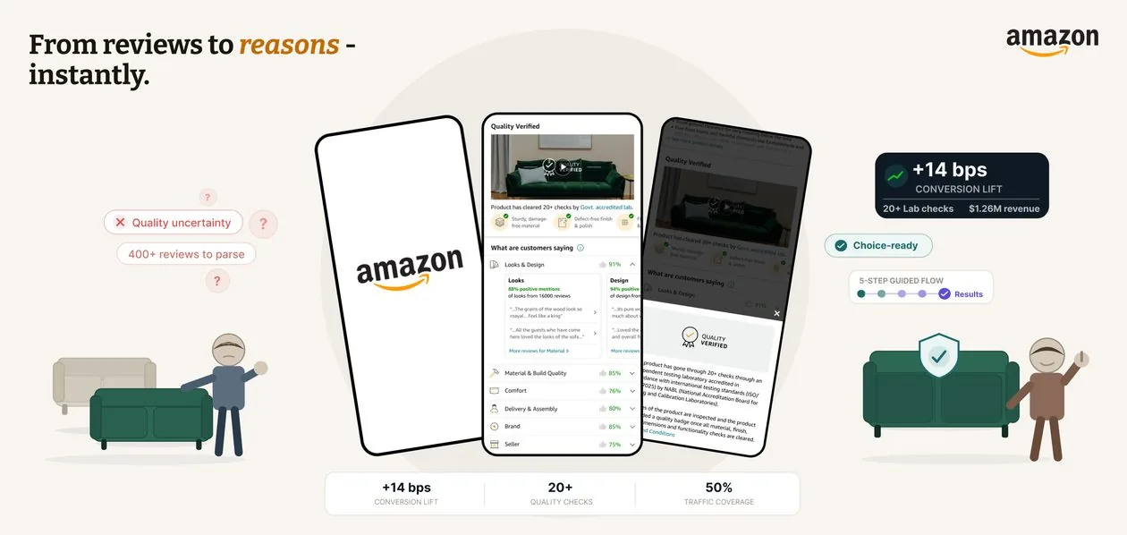
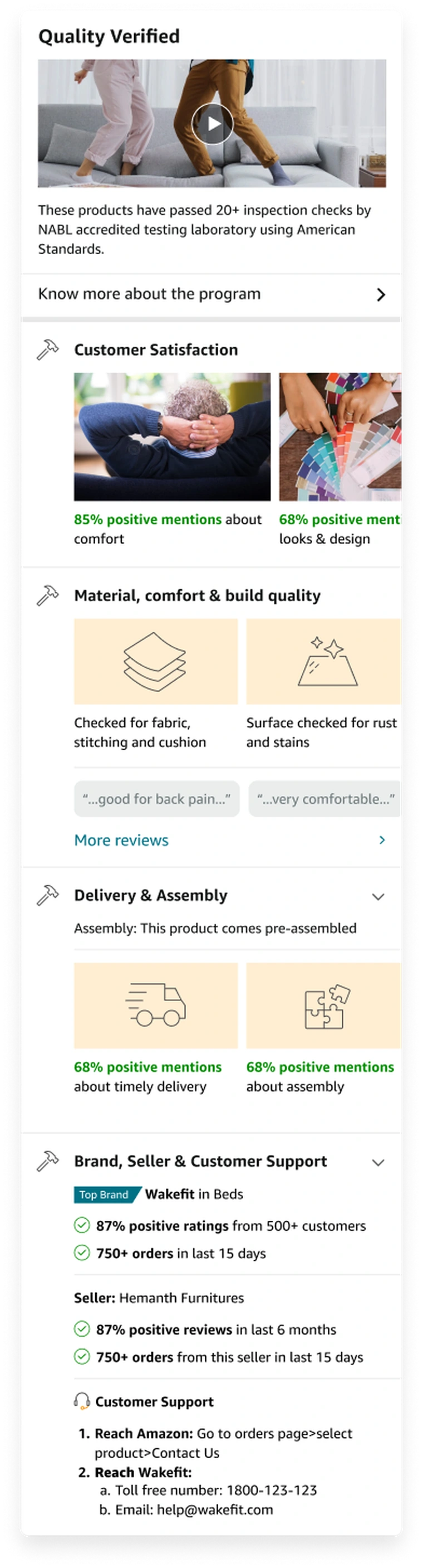
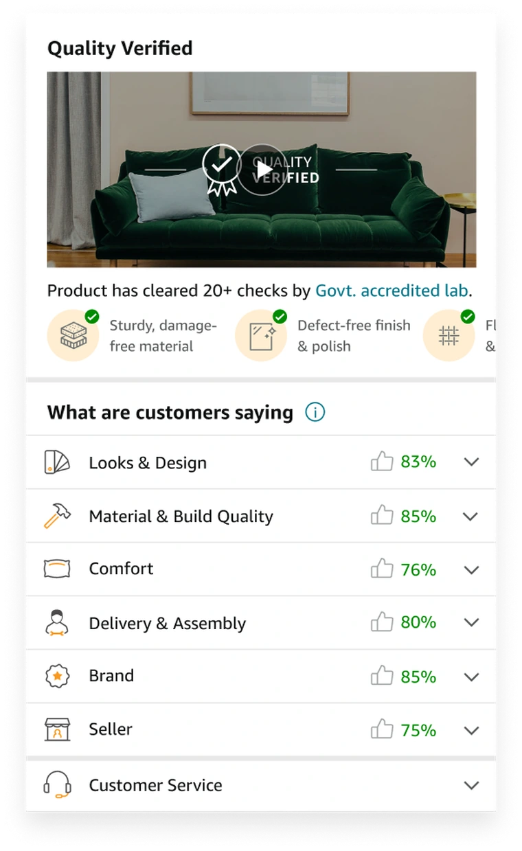
The trust signals were already on the page, just scattered across it. Synthesized quality proof, review sentiment, and seller trust into one module a skeptical buyer could actually read before committing.
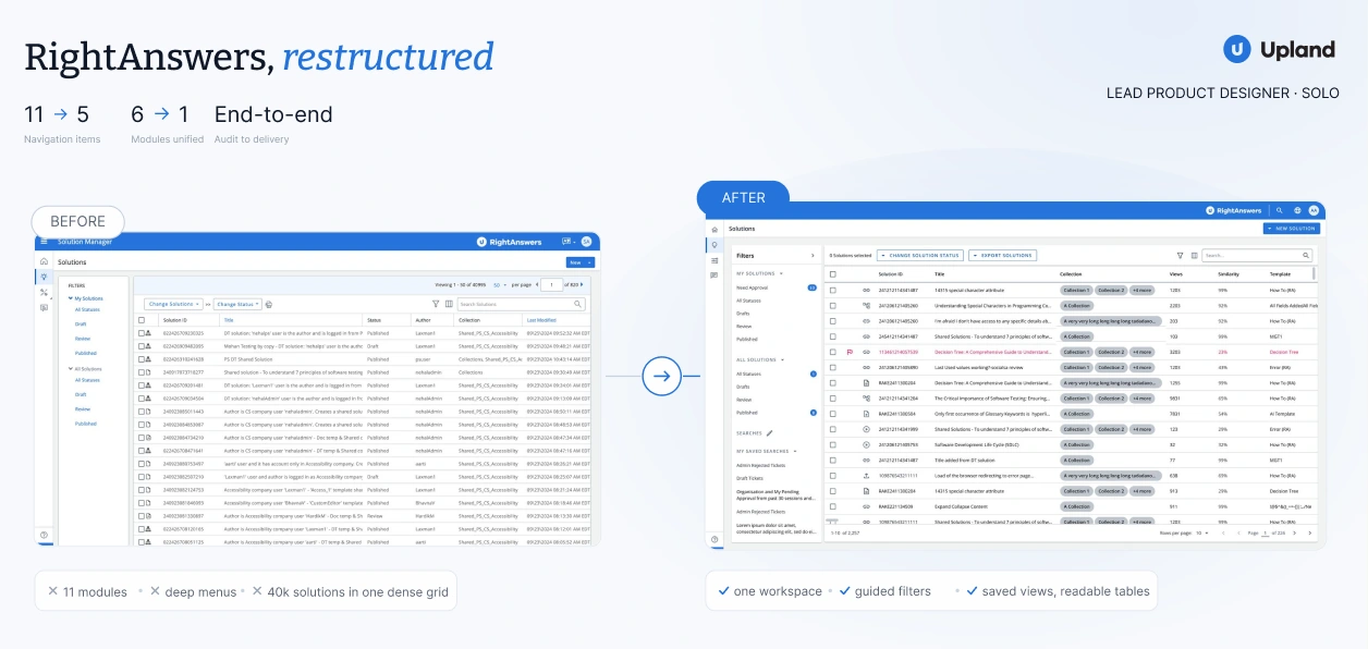
The brief was a UI refresh. The audit found six modules that had never shared a design model. Restructured Solution Manager end to end: navigation, forms, content lifecycle, solo, from audit to delivery.
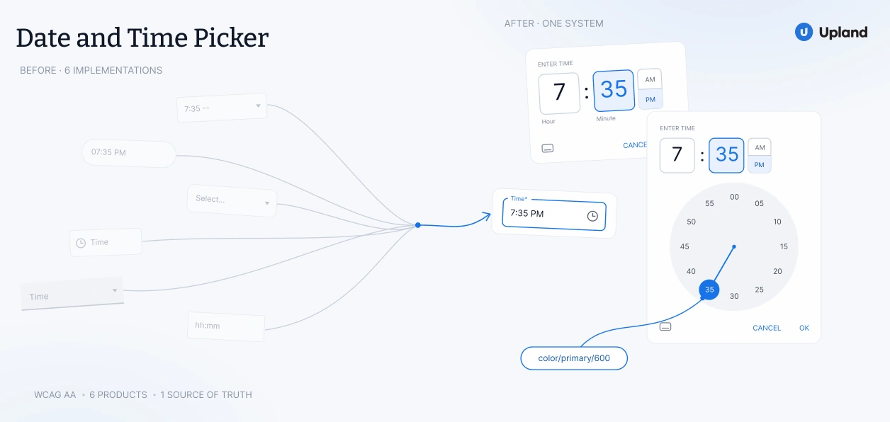
Six products, six different date and time pickers, none built the same way. Defined one interaction contract, accessible by default, and shipped it as a component every team could adopt instead of rebuild.
Helping customers buy the right product in categories they don't know how to shop
Platform
Amazon India
Category
OHL · Search & Discovery
Scope
Pilot → global launch
Outcome
+$10.9MM GMS
A guided discovery experience for Amazon India's OHL vertical, built to close the gap between what a customer wants to do and the product that actually does it.
The problem
Customers arrived with clear intent and no vocabulary. Search matched keywords; it couldn't translate a goal into a specification.
My role
Sole designer, end to end. The audit, flow architecture, UI, the A/B experiment, and the case for global rollout.
The result
+$10.9MM incremental GMS in a 28-day test. A template carried the pattern across the vertical.
769 → 198 → 34 results in four plain-language questions, with the specification taught at the moment of choosing. 16.6s, no audio.
The intent-to-specification gap
OHL covers more than 1,000 product types, most bought once every few years: a lock when you move, a geyser when the old one dies. Customers show up knowing the job ("secure my front door") and almost nothing about the product that does it. Search "door lock" and the catalogue answers with rim locks, mortise locks, aldrop bolts, handle sets and digital locks, ranked against the keyword, not the person.
The vocabulary that unlocks the catalogue (lock type, material, finish, access method) is exactly what an infrequent buyer has no reason to own. The gap isn't missing results. It's the missing translation between intent and specification.
The gap, stated plainly. Intent lives on the left, the specification vocabulary on the right, and standard search offers no bridge between them.
How I knew this was the real problem
I didn't take the gap on faith. Before proposing anything, I audited three sources of evidence: two from customer behaviour and one from the catalogue itself. They met from opposite sides. Customers could describe the job, not the product. The catalogue was indexed on the product alone. That gave me a problem statement I could defend to skeptical stakeholders, and it pointed the whole solution at translation instead of ranking.
Signal 01
Search behaviour
A large share of sessions scrolled, re-queried and left without opening a product. People were looking without finding. Results weren’t missing. The way in was.
Signal 02
After the purchase
Returns, questions and reviews traced back to one root cause: the wrong type bought for the job. A mismatch of understanding, surfacing downstream as cost.
Signal 03
Catalogue audit
I went through the locks catalogue by hand. Every filter was expressed in seller language: type, material, finish, access method. Nothing described what a lock is for. The catalogue was organised around what a product is. Customers arrive knowing what they need it to do.
Prior attempts
Two fixes already existed. Neither one closed the gap.
Amazon India had tried to solve this twice. I used both tools the way an honest customer would, and wrote down exactly where each broke. That gave the search and ads teams a shared reference to argue against when the harder decisions came.
Guided Navigation was fast, but it assumed expertise. The Buying Guide taught well, but it sat upstream of the decision, where few customers ever reached it.
Guided Navigation was fast, but it assumed you already knew
Guided Navigation was single-turn filter refinement with no education. To use it you already had to know the lock type, material and finish you wanted, the exact knowledge the customer lacked. It also couldn't grow. Its widgets shared placements with GCCP ad units and conflicted with dynamic ranking, so "add guidance to filters" was ruled out before it started.
The Buying Guide taught well, at the wrong moment
The Buying Guide was long-form education before selection. The content was sound. The timing wasn't. Chiclet choices were unintuitive, nothing branched, and nothing it taught became a live refinement. It asked customers to study before they could shop.
Product Finder had to be as quick as Guided Navigation and as informed as the Buying Guide. It had to deliver both inside the decision, under placement rules neither tool had to respect.
The insight
A discovery problem, reframed as a translation problem
Both earlier tools treated this as discovery: better results, faster. But speed does nothing for a customer who can't name what they're looking for. The real job was translation: converting plain-language intent into the specification the catalogue understands, and teaching just enough, at the right moment, to make the choice feel obvious.
Provide the right guidance during discovery so customers can find the most relevant product and make a confident purchase decision.
The brief I wrote for myself, and held every decision to
One shift in framing reorganised the whole solution space: from ranking results to translating intent, with education moved into the flow.
Naming the gap this precisely was the highest-leverage move I made. It compressed a sprawling "improve discovery" mandate into one sentence India and Global stakeholders could agree on before any UI existed. Vague problems produce vague debates. A specific gap produces specific decisions.
Design strategy
Designing for 1,000 categories before designing one screen
Locks was the pilot, never the deliverable. A flow that only worked for locks would never earn a rollout across 1,000+ types, so the first decision was an architecture rather than a screen: a configurable Q&A template where question type, option format, education and branching are all config, not code. Get the template right and a new category becomes a content exercise.
One template, every category. Making the system configurable was the precondition for global expansion being viable at all.
Architecture before pixels, so the sequence held
I mapped the complete flow before opening a single screen: search → ingress banner → mandatory Q1 (location) → mandatory Q2 (lock type, with education) → contextual questions → filtered results with applied tags. Fixing the structure first meant UI exploration happened inside a stable frame, instead of quietly baking assumptions into early comps. I built this alongside engineering from the start, because a template is only real if it's buildable. Pairing early meant the config schema I designed matched what the platform could actually render, not an ideal it couldn't.
The end-to-end architecture, fixed before UI work began: two mandatory questions, contextual branching, and results carrying the answers through as removable tags. I built it alongside engineering, so the config schema matched what the platform could actually render.
02Flow & Ingress
Resolve structure
Fixed the flow and the ingress-placement debate with a business case, before any screen encoded an assumption.
03UI & Decisions
Explore & decide
Prototyped three UI patterns to expose failure modes, then locked each decision with a documented trade-off.
Three directions, prototyped to their failure modes
Each direction was built far enough to fail in a specific, instructive way. Two reproduced the exact problems of the tools we were replacing. The third became Product Finder.
Buying-guide typeRejected
Education-first. Chiclets read as unintuitive, and it was slow to the decision. The Buying Guide's problem in new packaging.
AccordionRejected
Stacked form. Tidier, but still front-loaded education. And it couldn't express multi-node branching, because a choice at one level never reshaped the next.
Filter styleShipped
Inline + branching. Education below each option, live result counts, real branching. As fast as navigation, as informed as a guide. The one direction that solved both.
Craft & trade-offs
Five decisions that made it work
Five decisions carried the most weight. The first was less a design choice than a negotiation with the team that owned the real estate.
01 · Ingress · the contested one
Winning a way in without taking from the ads business
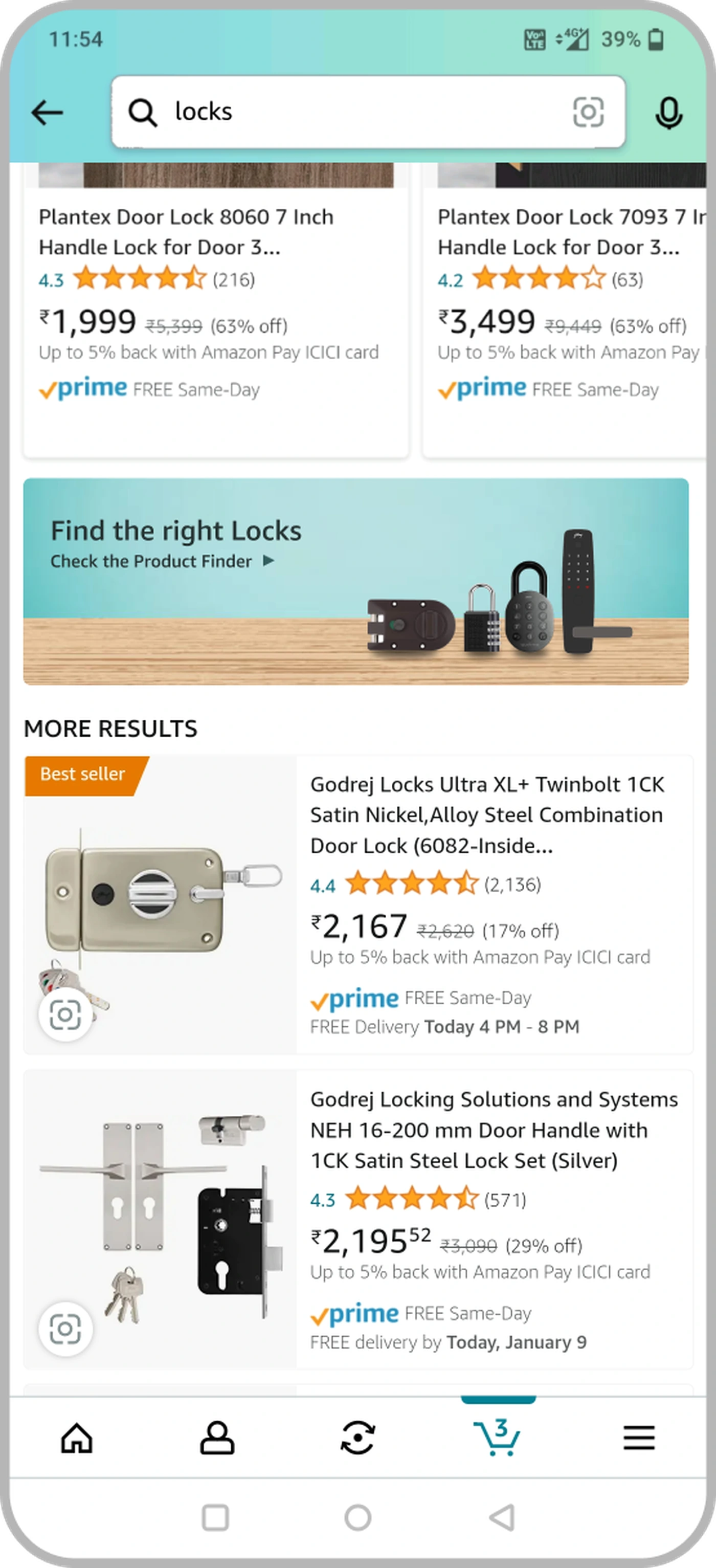
The entry point was a revenue decision, not a design one. The high-visibility option (a dynamic inline widget) sat on top of GCCP ad inventory and dynamic ranking. Rather than design around a constraint I couldn't move, I took it to the ads team early and we settled on a written trade-off: a static "Find the right Locks" banner in a predictable slot that never competes for ad space or reorders results.
The trade I madeThe static banner is less prominent than a dynamic widget would have been. I accepted lower visibility for zero conflict with ad revenue and ranking, and turned discoverability into something we'd measure in the experiment rather than assume. I studied Groww's calculator entry as precedent: a quiet, task-focused affordance can still pull real traffic.
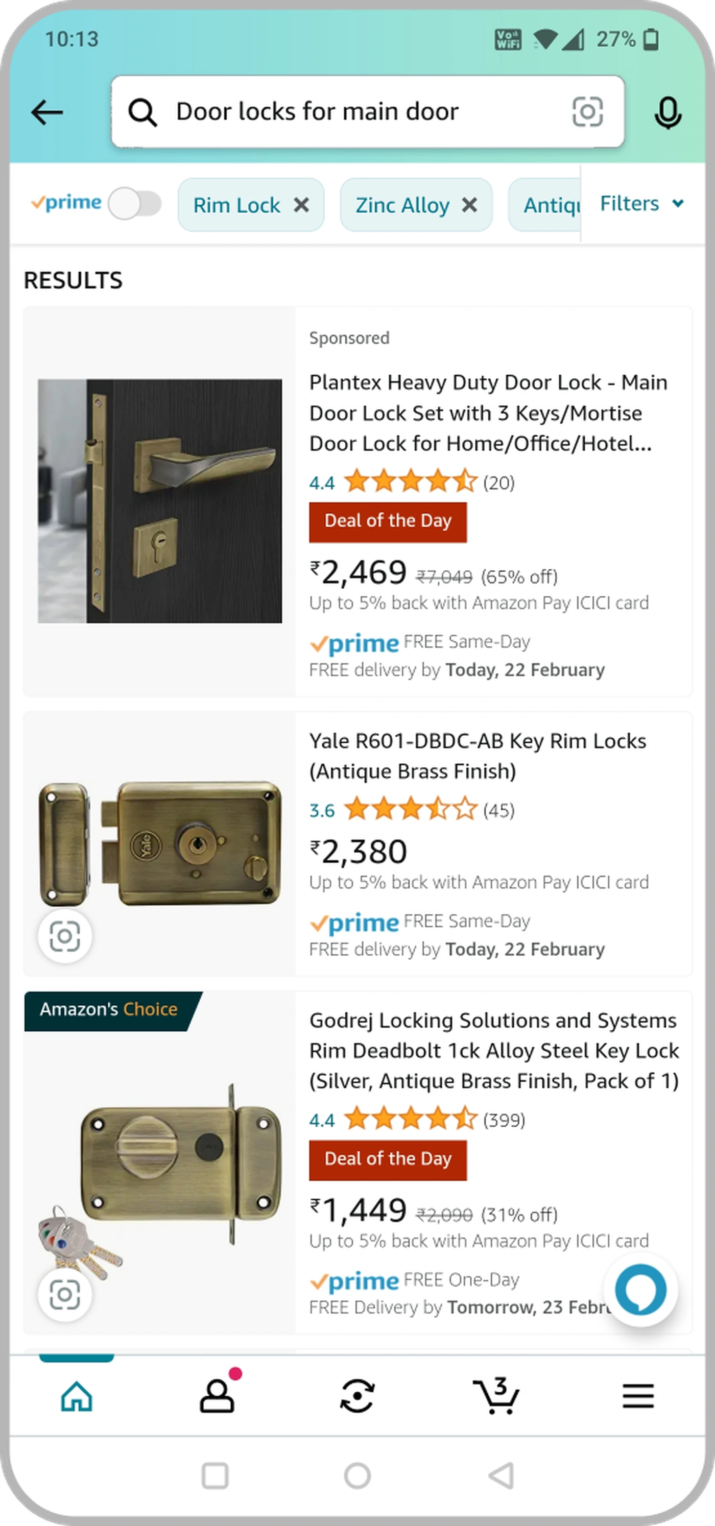
The static ingress banner, live on the locks SRP
02 · Questions
Mandatory questions that do the work, not the user
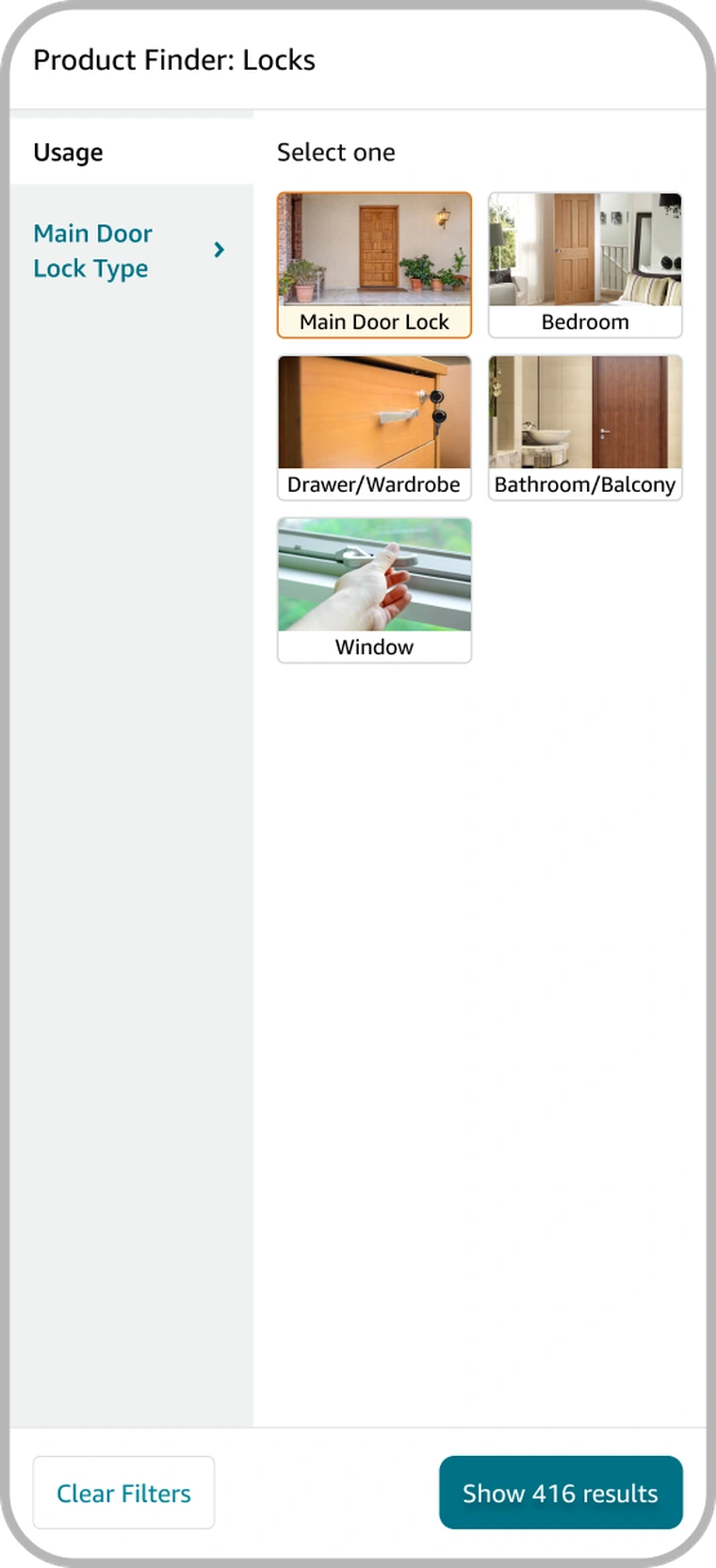
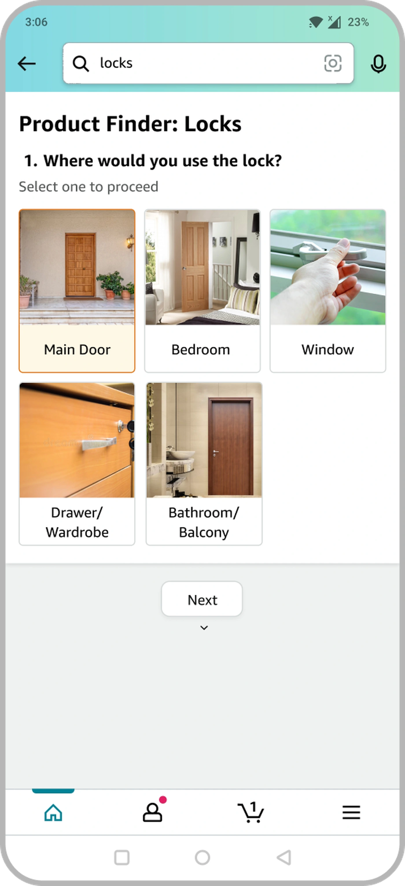
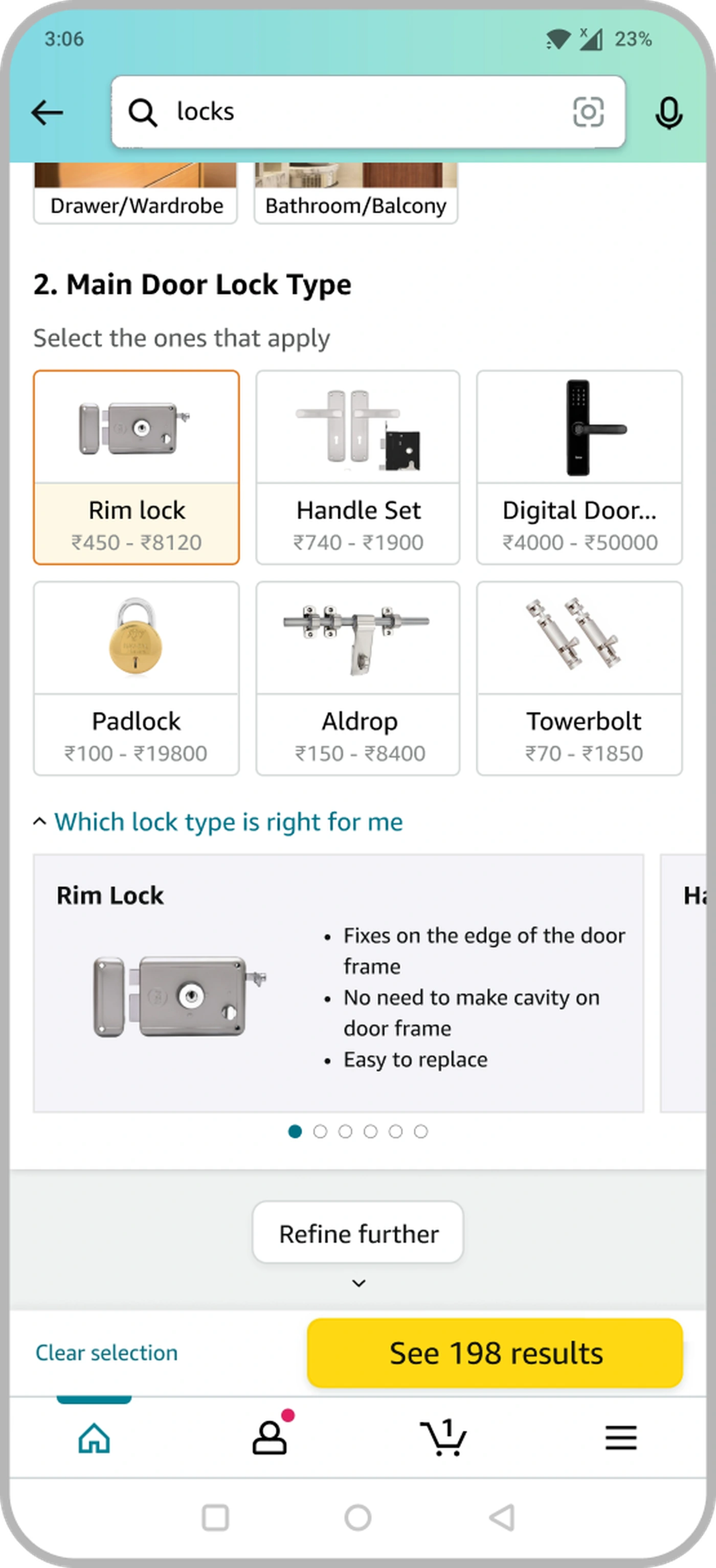
Q1, "Where would you use the lock?", is photo-based: pick Main Door, Bedroom, Window, Drawer/Wardrobe or Bathroom/Balcony. That sets the frame for Q2, "Main Door Lock Type," where each option is an image tile carrying its real price range, Rim lock ₹450-₹8120, Handle set ₹740-₹1900, Digital Door Lock ₹4000-₹50000, down to Padlock and Towerbolt. A live match count updates on every tap.
Free text and long dropdowns tested worse, for exactly the reason the project existed. They asked customers to produce vocabulary they didn't have. Image tiles carry the meaning instead, so recognition does the work rather than recall. The education ("Rim Lock: fixes on the edge of the door frame, no cavity needed") sits folded under the selected type. It's there when you want it, and out of the way when you don't.
Photo-based selection: recognition over recall
Real price ranges on the tiles anchor the choice in budget from the first tap
One answer required to proceed, so the flow never stalls on an optional field
Q1 · Usage
Q2 · Lock type
03 · Contextual branching
Questions that adapt to prior answers
Optional questions branch on the Q2 answer. Rim Lock asks about Material and Finish. Digital Door Lock asks about Access Method and Special Features. A generic set would have been simpler to build, but it would show irrelevant options the moment a customer committed. One wrong question costs more trust than five right ones earn back.
04 · Live result count
A running count that turns a form into exploration
Every selection updates a live count of matching products. Watching it fall from 769 → 198 → 34 reframes the whole interaction. Each answer visibly does something, so the flow reads as exploration instead of a form to endure. A step counter ("2 of 4") would have shown progress, but not that the answers were narrowing anything. The count does both, and every tap feels consequential.
05 · How it shipped
Building the template into the pilot
The strategy had to survive a deadline. The fast way to launch the pilot was a hand-built flow. The durable way was to ship the configurable template underneath from day one. I made the case for the slower path. A bespoke locks flow would prove the idea, and then need rebuilding to prove it anywhere else.
The trade I madeShipping the template cost us time on the pilot that a one-off wouldn't have. In return, the day the India numbers came in, extending to fans, geysers or power tools was configuration. Portability was the precondition for the rollout being viable. It had to exist before the results, not after.
2-3
Contextual optional questions per lock type
4-6
Steps from search to filtered results
1,200→34
Products shown, unguided vs guided
1,000+
Product types the template supports
Validation & impact
28 days, a clean 50/50 split, one unambiguous result
I designed the experiment with the applied-science team: 28 days, 50% of India's OHL traffic, control on the standard results page and treatment on Product Finder. The primary metric was incremental GMS. The guardrail was ad revenue, the same GCCP concern that shaped the ingress decision, now measured directly. That let us prove the banner earned its slot without quietly taxing ads. It didn't. The treatment lifted GMS while holding ad revenue flat.
I led the readout and carried the numbers into the rollout conversation. The lift was clean enough that Global greenlit worldwide expansion off the India data alone. Because the template already existed, other teams could extend the pattern without a rebuild.
No ambiguity in the signal. The revenue outcome and the decision to expand globally were both direct outputs of the India result.
The treatment experience
What the guided path delivered
Where control saw an undifferentiated wall of listings, treatment landed on a curated results page. The customer's answers carried through as removable applied tags (Rim Lock, Zinc Alloy, Antique Brass), and the count collapsed to a relevant set. That is the endpoint the +$10.9MM was measured against: not more results, but the right ones, arrived at with confidence.
India results directly triggered the worldwide rollout decision
28 days
Experiment duration
Clean test, unambiguous revenue signal
50 / 50
Audience split
Control vs treatment, India OHL vertical
1,200→34
Results narrowed
From undifferentiated catalogue to a curated set
1,000+
Product types supported
One template scales across all OHL categories
Reflection
What I'd carry forward, and what I'd revisit
Carry forward
Name the gap before you design
Framing this as an intent-to-specification gap compressed a broad "improve discovery" mandate into one defensible sentence. It's the highest-leverage move in a project. I now spend real time on it before touching a screen.
Carry forward
Constraints are a brief, not a wall
The ingress banner began as a limit from the ads business and became the sharpest decision in the project. Taking the constraint to the team that owned it, early, turned a blocker into a defined space to design inside.
Carry forward
Quantified feedback beats instruction
A live result count did more for perceived progress than any copy could. "769 → 198 → 34" told customers they were getting closer without a word of guidance. It's a pattern I've reached for well beyond this flow.
What I'd revisit
The static banner was right under the constraints. It trades visibility for safety, and I shipped it without fully knowing who the quieter entry point never reached. With the engagement data the experiment produced, the next iteration is a query-aware trigger that still lives inside the ad-placement rules, earning back visibility from evidence rather than assumption.
The through-line: scale is an architecture decision
The change that moved the most money was never visible in a single screen. It was the template that made every screen unnecessary to design one at a time. The intent-to-specification gap shows up anywhere customers know the job and not the product. Designing the pattern to travel from day one is what turned an India experiment into a platform decision.
Know Your Purchase, a product-page module that turns Amazon's scattered trust signals into one confident answer to the question a furniture buyer is actually asking: should I commit?
The problem
On a considered furniture buy, the customer has already found the product. They stall at commit. The trust signals exist, but they sit scattered across the page and read as claims.
My role
Design lead, end to end: research synthesis, the module's IA and interaction, the ship-vs-ads negotiation, and the weblab.
The result
+14 bps conversion and +$1.26MM incremental revenue in a 28-day test. Enough to green-light a worldwide dial-up.
Both signals in situ: Quality Verified opened into inspectable proof and an accreditation modal, then 16,000 reviews resolved into aspect-level sentiment. 11.6s, no audio.
The signals were all there. They weren't arranged as an answer.
The furniture PDP was not missing trust signals. It had a "Quality Verified" badge, a warranty strip, customer ratings by feature, and thousands of reviews. The problem was arrangement. The signals sat scattered down the page as separate claims: a badge in one place, feature ratings far below, reviews below that. A buyer asking "is this actually any good, and can I trust who's selling it?" had to assemble that answer across screens. Most didn't. They stalled at commit, or defaulted to the cheapest option. Furniture makes the stakes plain. A bed or a sofa is a five-figure purchase. You choose it from photos and text, and you live with it for years. On a decision that size, evidence spread across the page is close to no evidence.
Not an information problem. A synthesis problem. The signals existed. The work was structuring them into one scannable answer at the point of hesitation.
Where the friction actually lived
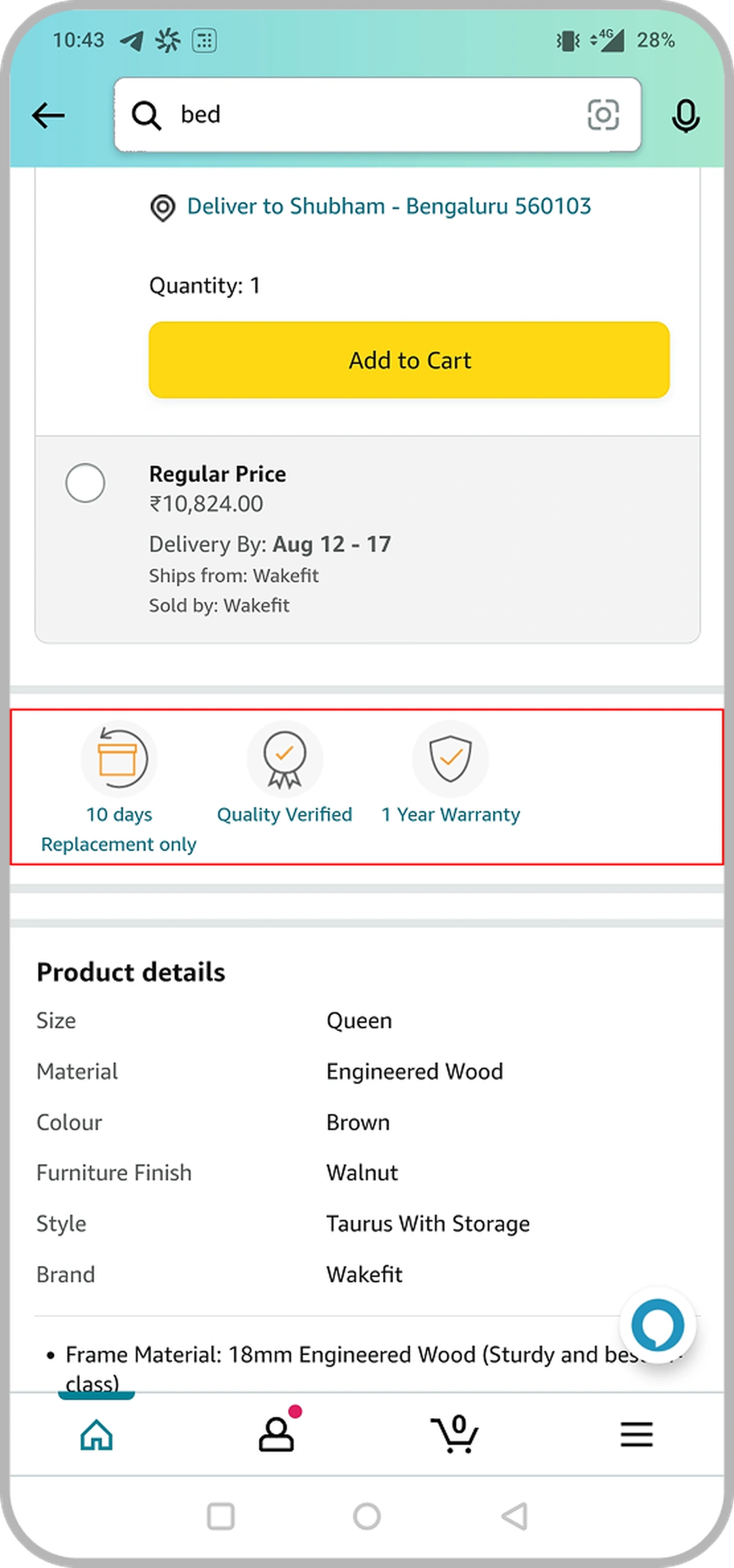
The current PDP is the evidence. Trust cues are real, but disconnected. A replacement/warranty strip in one place, "customer ratings by feature" much further down, reviews below that. None of it framed to answer the buyer's underlying doubt.
The existing PDP, trust cues present, but scattered
The reframe
The four questions a buyer can't shake
Instead of "surface more trust content," I reframed the problem around the buyer's actual questions. Sitting with reviews, returns, and support logs, the hesitation nearly always reduced to four. A confident purchase is just a page that answers all four before the customer has to go looking. That reframe became the module's information architecture. Every element earns its place by answering one of the four.
The four-question frame became the spec. If a proposed element didn't answer one of these, it didn't ship. That mattered enormously once space got scarce.
Annotating the proposed module against those questions made the intent legible to partners early, engineering, the reviews-science team, and the ads business could all see why each block existed, not just what it showed.
The module, mapped to the buyer's questions
Signal 01 · Verification
Turning a badge into proof
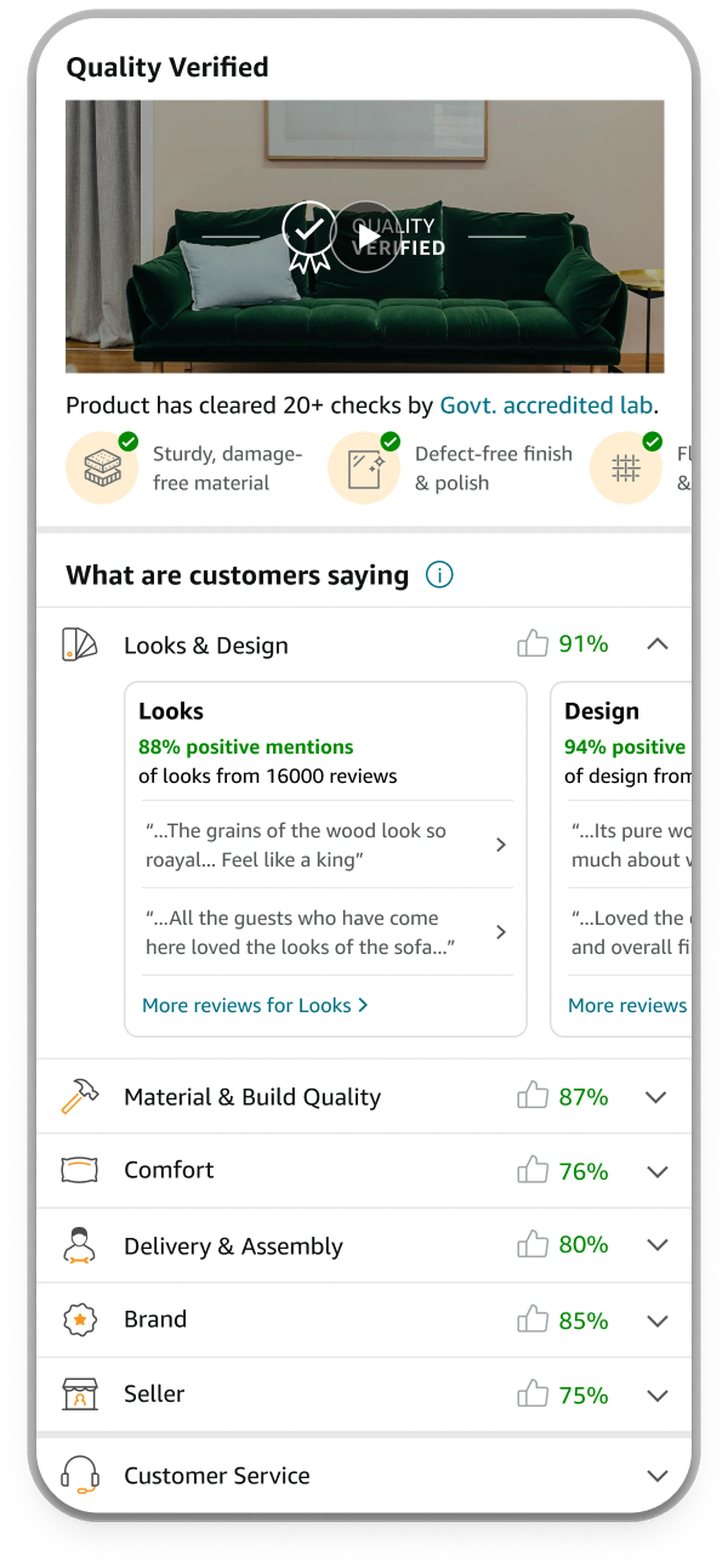
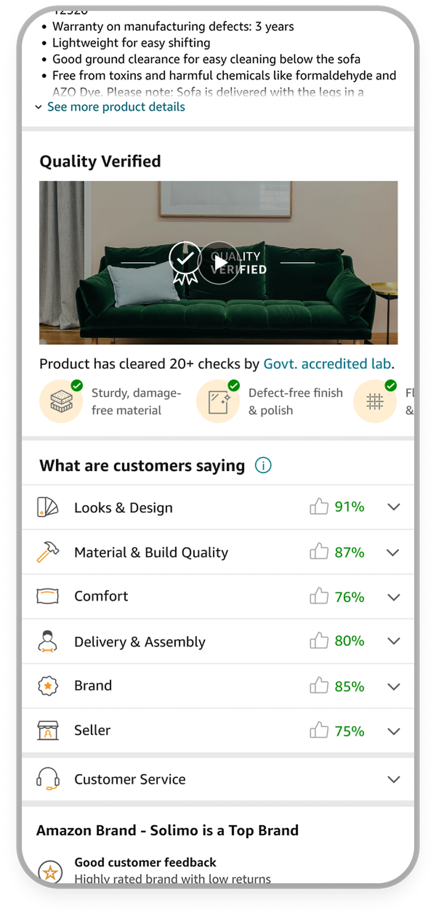
"Quality Verified" already existed as a badge. A badge is a claim, and a claim doesn't move a skeptical five-figure buyer. Evidence does. So the first module rebuilt Quality Verified as proof you can inspect: a lab-test video, a plain statement that the product cleared 20+ checks by a Govt-accredited lab, and a carousel that translates those checks into outcomes a person cares about: sturdy material, defect-free finish, flaw-free fabric and stitching, verified dimensions.
The trust ladder: badge → visible checks → per-test outcomes → a full accreditation modal for the buyer who needs to go deeper.
Decision · depth on demand
A modal for skeptics, not a wall of text for everyone
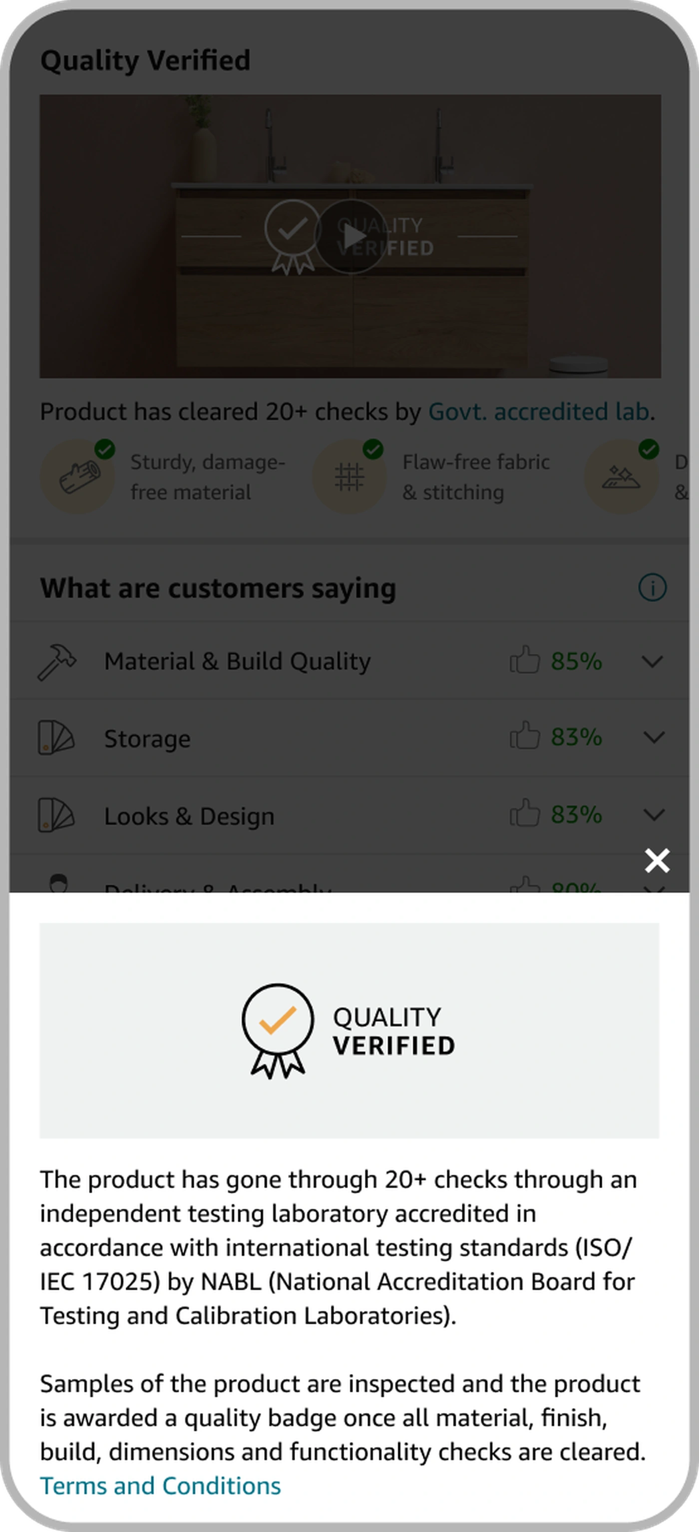
The accreditation story is dense: independent testing lab, ISO/IEC 17025, NABL, sample inspection, the badge awarded only after all checks clear. Early versions put all of that on the page, and design rightly flagged them as too textual. The fix wasn't to cut the credibility. Skeptics need it. The fix was to tuck it behind a "Know more" modal. Confident buyers move on. Doubters get the full proof one tap away.
Trade-offConsidered inline accreditation copy for maximum transparency. Chose a modal. The page stays scannable and short, which the ads constraint demanded, and the heavy proof is one tap away for the people who actually want it.
The accreditation modal, depth for the skeptic
Signal 02 · Reviews
Turning 16,000 reviews into a signal
The reviews carried real trust, and they were hard to use. Thousands of them, unstructured, hard to skim for the one thing you care about. Partnering with the reviews-science team, we distilled them into aspect-level sentiment, the dimensions people actually weigh a bed or sofa on: Looks & Design, Material & Build Quality, Comfort, Delivery & Assembly, Brand, Seller, Customer Service. Each shows as a % positive drawn from real review analysis, not a star average.
Aggregate → aspect → snippet → the full review. Every level down is optional; the buyer stops at whatever depth answers their doubt.
Interaction · progressive depth
From a number to the sentence that earns trust
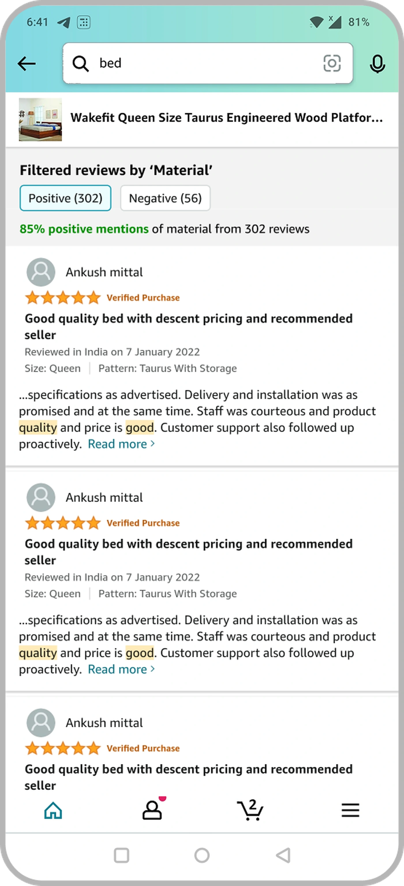
A percentage builds confidence. A specific review sentence adds to it. So each aspect opens into representative snippets, and any aspect becomes a filter on the full review list: a Positive / Negative toggle, keywords highlighted in context. A buyer can go from "85% positive on build" all the way to reading the exact reviews behind it, without leaving the flow.
Aspect % anchors the judgment at a glance
Snippets make the sentiment concrete and human
Aspect-filtered reviews let doubt resolve itself against real evidence
Aspect sentiment → aspect-filtered reviews
The constraint that shaped everything
The fight for page space
Here is what made this a hard design problem rather than a nice one. Two rich modules, verification and reviews, want a lot of vertical room. Page height on a PDP is not free. Everything the module added pushed ad placements further down the page, and past a certain point that costs measurable ad revenue. A feasibility review with engineering and the ads business was blunt: the tall, text-heavy versions would not pass for launch. The design had to fit the height the ads business could afford to give up.
The real brief wasn't "design a trust module." It was "design the most convincing trust module that fits inside the height the ads business can afford to give up."
Every exploration measured against one line: the height beyond which ad viewability, and revenue, drops. Convincing wasn't enough. It had to be convincing and short.
Three directions, killed for height before one survived it
We didn't arrive at the compressed module by taste. I built three directions, and each failed against a version of the same constraint before one survived it: too textual, too tall, or too heavy for tech to ship without dropping ads. What survived kept the proof and the sentiment and shed everything that was explanation for its own sake.
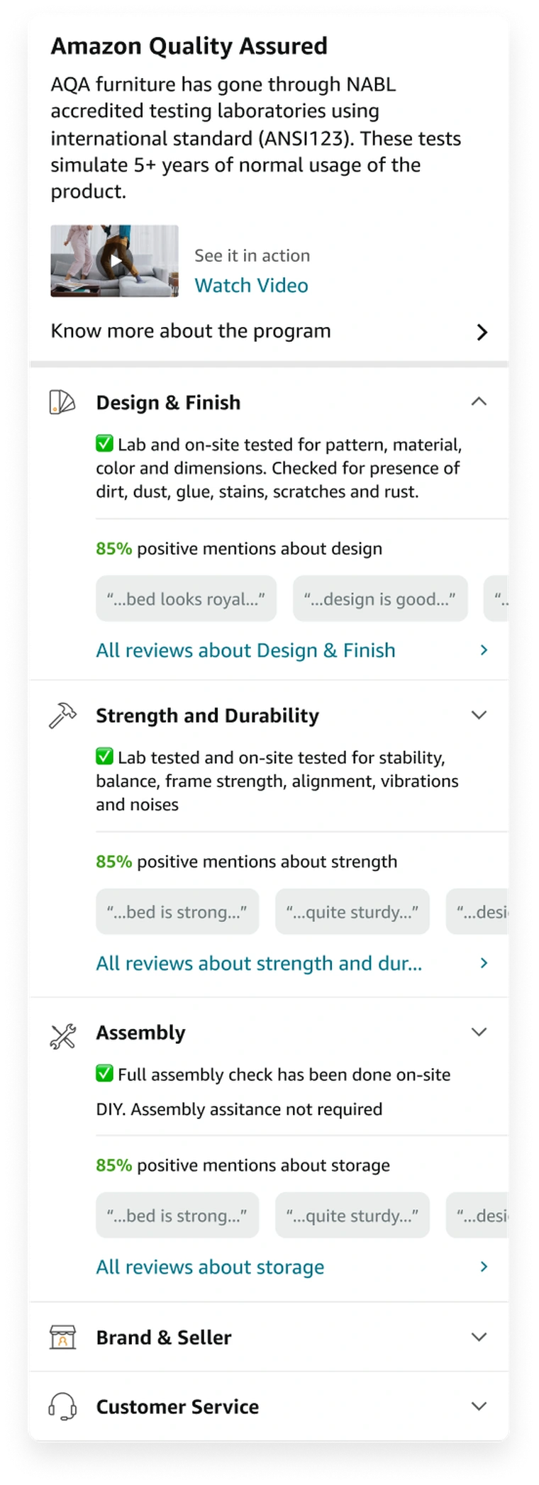
Text-first (AQA)Too textual
Accreditation and test detail as long copy. Credible, but a wall. Design flagged it, and the height was unworkable.
Full widgetOver budget
Everything expanded: imagery, per-aspect cards. The most complete version, and the most over the height the ads business could give.
Compressed finalShipped
Video proof plus collapsible aspects, with depth on demand behind taps. Same conviction, a fraction of the height. This one passed.
Compression became the design. Collapsible aspects, a modal for the accreditation, snippets and filters behind taps. Every rich thing still exists, but its default state is small. The page reads in seconds, and the depth is there for anyone who wants it.
Impact
Did it earn its space?
Because the module was funded, in effect, out of the ads business's page height, the bar was specific. The confidence it added had to outweigh the ad revenue its height cost. So the experiment measured that directly: a clean 28-day A/B, control versus treatment, 50% of India traffic, read on conversion and revenue. It cleared the bar, and cleared it well enough that the India result set up a worldwide dial-up of the weblab.
+14 bps
Incremental conversion (OPS-i)28-day A/B · control vs treatment · 50% audience · Amazon India
→ WW
India result set up the worldwide weblab dial-up
+$1.26MM
Incremental revenue
OPS lift over the 28-day window
28 days
Experiment duration
Clean control-vs-treatment read
50 / 50
Audience split
India, furniture PDP traffic
7
Trust aspects synthesised
From 16k+ unstructured reviews
The number I care about most isn't the revenue. It's what the revenue proves. A module built under a hard space constraint, with its richest content deliberately collapsed, still moved a five-figure-purchase decision. Confidence, structured well, was worth more than the page height it cost.
How it shipped
Convincing the people whose space it took
None of this ships without the ads and engineering partners agreeing to give up the height. The four-question framing and the compressed, depth-on-demand design were as much a negotiation artifact as a design one. They let me argue, concretely, that every pixel was doing trust work, and that the conversion upside was worth the ad trade. The weblab result settled the argument for the WW rollout.
The module in its PDP home
Reflection
What building trust taught me, and what I'd revisit
Carry forward
Confidence is a synthesis problem
The signals were all on the page already. The value wasn't new information. It was structuring what existed into a single answer at the moment of doubt. I now look for the synthesis before assuming I need more content.
Carry forward
Proof beats claims
A "Quality Verified" badge is a claim. A lab-test video and 20+ inspectable checks are proof. Turning the same fact from assertion into evidence is often the whole design job on a trust surface.
Carry forward
Constraints are a design tool
The ad-height limit forced depth-on-demand: collapse, modal, filter. The compressed module wasn't a lesser version. The constraint is what made it disciplined enough to ship and to work.
What I'd revisit
The module leads with positive sentiment, % positive up front, negatives one tap away behind the toggle. It converted, but I'm not sure it's the most trustworthy default. My instinct now is that surfacing balanced sentiment more prominently could build deeper, stickier confidence, especially for the most skeptical buyers. I'd want to test a more visible negative view against the current one rather than assume positivity-first wins. The second open thread is the lab-test video. It's the strongest single proof point, but I never measured whether people actually watched it or scrolled past. That number would tell me how much height the video truly earns.
The through-line
Product Finder was about the moment before you know what you want. Know Your Purchase is about the moment after, when you've found it and still hesitate. Designing for that pause is a different craft. Less about paths and filters, more about assembling scattered proof into the confidence to commit, and doing it in whatever small space the business can spare.
Redesigning RightAnswers: When the Brief Needed Rethinking
PRODUCT
RightAnswers, Upland Software
ROLE
Lead Product Designer
SCOPE
Audit · IA · Flows · UI delivery
PLATFORMS
Salesforce · ServiceNow
Support agents using RightAnswers were spending more time navigating the platform than using it. The product worked technically, but the experience had accumulated years of structural inconsistency. The brief was a UI refresh. It became something bigger.
A product that worked technically. An experience that didn’t.
Enterprise knowledge management is a hard design problem. Support teams manage thousands of articles across product lines, juggling approval workflows, governance and taxonomies while agents pull answers under SLA pressure. A wrong or stale article costs time on every ticket that touches it.
RightAnswers had the integrations and the infrastructure. Solution Manager, the core authoring interface, was where it fell apart. The damage was structural, not visual. Modules had been built independently, with no shared model holding them together.
What was asked
Align Solution Manager with the Upland design system and clean up the visual inconsistencies. A well-defined brief, deliverable in weeks.
What the audit found
Structural failures beneath the visual ones, in the workflows, the information architecture, and the interaction model. A cleaner surface would have masked them, not fixed them.
What was delivered
A full UX restructure, now live across enterprise support teams globally, with Airbnb as a named deployment, and patterns contributed back to the Upland design system.
01 · EVIDENCE
What the audit found
The audit found one root cause behind six modules of symptoms. The product had been built feature by feature, for longer than its architecture could sustain. It showed in four places (the interaction model, the information architecture, the forms, and the content lifecycle) and each got worse at the scale RightAnswers was sold into.
The product as agents saw it every day. Navigation structured around system architecture, not tasks. The same feature set reachable through eleven separate entries.
Agents were working around the product, not with it. That's the clearest signal that a UX problem runs deeper than the interface.
Behavioural inconsistency across modules
Dropdowns that expanded in one module collapsed in another. Confirmation dialogs appeared inconsistently. Tab navigation broke without warning. Each module had been built as a standalone product, so users could never build confidence in a system that didn't work the same way twice.
Navigation organised around the system, not the task
Finding an article in review took a different path than finding one in draft, and bulk actions sat three levels deep. The product had menus for features. It needed menus for tasks.
Multi-step processes with no progressive disclosure
Article creation opened with 14 fields, metadata, categorisation, audience targeting, expiry, before a word of content. Experienced users built workarounds to defer them; new users made errors. Every interaction assumed all decisions had to happen at once.
Content lifecycle without governance guardrails
Articles moved between statuses with no audit trail, and expiry surfaced only after content had gone stale in front of customers. At thousands of articles per team, that absence was a real governance risk. Outdated answers reaching customers through agents with no way to know.
An interaction model that broke at enterprise volume
Pattern audit, interaction variants mapped across all six modules, colour-coded by failure type. Five symptoms, one root cause: no shared design foundation.
02 · THE PIVOT
The case for more scope
Two weeks into the audit, the brief was wrong. Aligning Solution Manager with the design system and cleaning up visuals was deliverable in weeks, but it would have painted over structural failures instead of fixing them. So I made the case to expand scope, backed by the audit rather than by opinion.
A UI refresh delivered as scoped would have put visual consistency on top of a structurally broken experience. Agents would have seen a tidier interface and hit the same fragmented navigation, the same overloaded forms, the same missing states. The friction would have survived the redesign.
The pivot, as it happened: brief at week zero, evidence at week two, the call to retire the brief, and the order of work that followed, visuals last.
The expanded scope addressed four compounding problems, in a deliberate order:
The workflow problem: multi-step tasks with no progressive disclosure, presenting too many decisions at once
The IA problem: navigation structured around system architecture, not around user tasks
The consistency problem: six modules built independently, with no shared interaction model between them
The visual problem: UI misalignment with the Upland design system, addressed last, once the structure was resolved
THE TRADE-OFF
Accepted: running a full audit before opening Figma slowed the visible output in the early weeks. Gained: every decision that followed had a rationale grounded in evidence, not aesthetic preference. And a scope the stakeholders had already agreed to.
03 · STRATEGY
Structure before surface
With scope agreed, the sequencing was the strategy. Design the final UI last, not first. Without the structural work underneath it, visual consistency would only be cosmetic.
Discovery
AUDIT PHASE
Mapped every component and interaction pattern across all 6 modules, end-to-end
Identified divergent interaction patterns performing the same functional role across different modules
Traced navigation failures to their root: IA structured around system architecture, not user tasks or mental models
Produced a pattern audit that became the primary artifact for making the scope expansion arguable
User flows
FLOW PHASE
Remapped the article creation journey: surfaced the 14-field first-screen problem that was driving completion errors
Mapped the review and approval workflow: found that steps had been added over time without any ever being removed
Documented the gap between how flows were designed and how users were actually navigating them
Used flow mapping to establish the case for progressive disclosure before any interface design began
Information architecture
STRUCTURE PHASE
Restructured navigation around four user modes: authoring, organising, reviewing, administering
Reduced primary navigation depth from 4 levels to 2 across the most-used task flows
Renamed navigation items around user tasks rather than system feature names
Resolved the IA before designing any screens, giving the visual work a structural foundation to anchor to
A heuristic audit of Solution Manager, grouped into four themes, with direct user feedback.The as-is editor’s upfront wall, restaged into a write-first flow.A deep feature tree restructured into a shallow, task-based map.
04 · THE BETS
Three bets that shaped the redesign
These aren't visual improvements. They're decisions about how the product should behave, each with a cost accepted deliberately. The Upland design system alignment came after all three were resolved.
BET 01 · PROGRESSIVE DISCLOSURE
Showing the right things at the right time, not everything at once
Article creation opened with 14 mandatory fields before any content: metadata, categorisation, audience targeting, expiry, all on load. I cut it to 4, staged the rest, and surfaced governance fields contextually. Core content first, classification on save.
Staged creation: core content first, classification on save
Governance fields surfaced contextually, not on load
14 upfront fields reduced to 4, remainder staged or removed
Classification errors reduced by deferring decisions until context existed
THE TRADE-OFF
Accepted: the step count increased slightly. Gained: the cognitive weight at each step dropped significantly, and completion errors fell with it.
BET 02 · TASK-FREQUENCY HIERARCHY
Organised by what people actually do, not what the product offers
Every screen had been designed for completeness: every option present, regardless of how often it was used. Action-frequency analysis of common user sessions showed that the top 20% of actions accounted for the overwhelming majority of daily interactions. The redesign surfaced those actions at the primary level and moved the long tail behind explicit affordances. Users stopped scanning full menus to find one item.
Primary actions surfaced by usage frequency, not alphabetical order
Secondary and admin actions moved behind explicit affordances
Navigation landmarks consolidated from 11 to 4 primary sections
Common tasks reachable in 2 interactions, previously four
THE TRADE-OFF
Accepted: the long tail now costs an extra click, and power users notice. Gained: the tasks people run hundreds of times a day stopped paying a scanning tax on every visit.
BET 03 · SHARED INTERACTION MODEL
One experience, not a collection of modules
The most consequential work was the least visible. Auditing every pattern across six modules exposed the full scope of the fragmentation. I unified it into one model, so learning one module means learning them all.
6 modules
Unified under one interaction model
One library
Shared pattern library replacing divergent logic
Upland-wide
Patterns adopted beyond this product
None
Re-onboarding required between modules
THE TRADE-OFF
Accepted: months of work with nothing visibly new to demo. Gained: users who learn one module have learned them all, permanently.
The unified component set, shared interactions applied across all six modules. The same matrix as the audit, resolved to one behaviour per pattern.
05 · CONSTRAINTS
Working the constraints
Solution Manager ships inside Salesforce, ServiceNow, direct portals and more, environments RightAnswers doesn't control. Every pattern had to hold up everywhere it rendered, not just in a clean Figma frame.
Support agents on SLA timers, knowledge managers accountable for governance, administrators managing integrations, each needed the same interface to behave predictably under very different pressure.
One designer carrying audit, IA, flows, component design and UI delivery. The artifacts had to do the persuading. The pattern audit argued for scope. The flow maps argued for the structure.
20+
Embedded deployment contexts, Salesforce, ServiceNow, direct portal
3 roles
Agents, knowledge managers, administrators, one interface, four modes
Solo
One designer across audit, IA, flows, components, and delivery
Evidence-led
Artifacts carried the stakeholder case at every phase
06 · OUTCOMES
What shipped, and what it changed
The metrics here are structural, not instrumented. This was an enterprise redesign, not a consumer product with A/B infrastructure. The evidence is in what the redesign retired: 14 fields to 4, six modules to one model, 11 navigation landmarks to 4. Now live across enterprise support teams globally, Airbnb among them.
BEFOREPre-redesign IA: 11 primary items, grouped by feature and system architecture.AFTERPost-redesign IA: 4 primary sections, grouped around authoring, organising, reviewing, administering.
End-to-end
Content lifecycle redesigned as one system
Creation, review, approval, and expiry now behave as one governed flow instead of disconnected module features.
6 → 1
Navigation models unified
Six module-specific models replaced by a single interaction model users learn once.
Airbnb
Named enterprise deployment at launch
Among several large-scale support organisations running the redesigned product.
Upland
Design system contribution
Patterns extended into the broader Upland product suite.
The design system went in both directions
Aligning with the Upland design system was the final phase, and it ran both ways. The structural complexity of Solution Manager surfaced gaps in the system's own patterns. I fed them back, so the work strengthened the system it drew from.
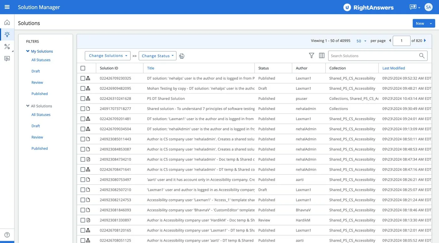
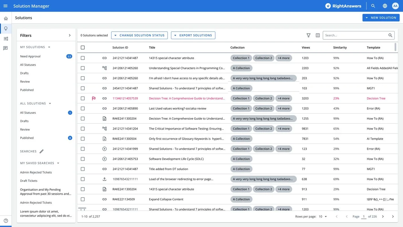
Redesigned Solution Manager, the delivered interface across its primary surface: guided filters, saved views, and a readable table at enterprise volume.
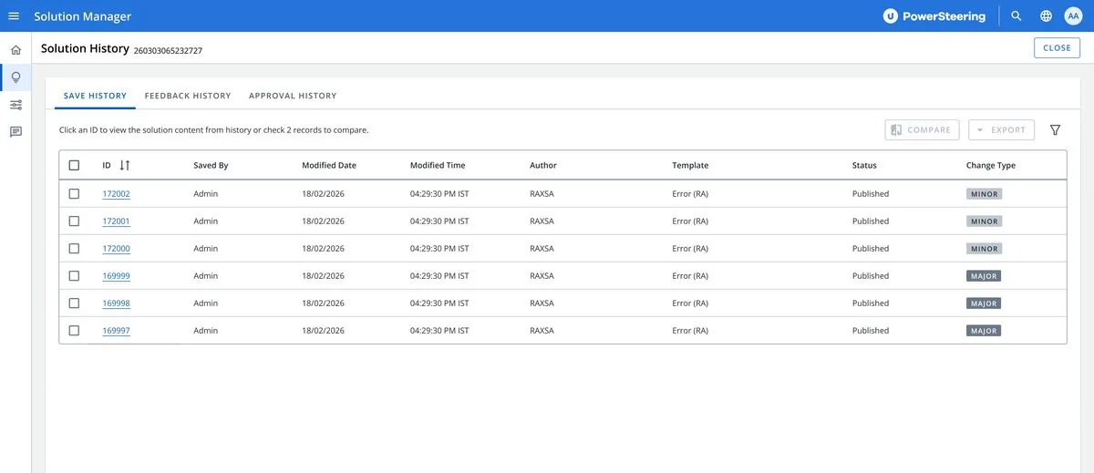
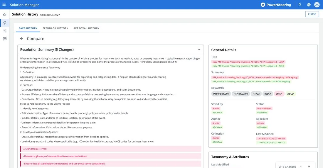
Version history with change types and clear comparison entry points.Card-based compare: changes grouped and counted per section.
07 · HINDSIGHT
The project that was almost too small to change anything
Resolving the IA first made the design system work actually land
Visual consistency is meaningless on a fragmented navigation model. The component library would have looked correct in Figma and shipped compromises into every embedded context, because the structure underneath it hadn't changed.
Enterprise users reward predictability, not novelty
This user base isn't looking for delight. They're agents on SLA timers and managers governing large content estates. The redesign optimised for the thing they actually needed: an interface that behaves the same way every time.
What this project taught me about scope
A product's visual layer can be healthy while its structure fails. The only way to tell is to audit the flows, IA and interaction model first. That audit is what turned a cosmetic brief into a structural one.
The scope expansion was the senior move, not a discovery miss. It was the right call, at the right moment, with the right evidence. Redefining the problem before solving the one you were handed is often the whole job.
One Date & Time System to Replace Six Fragmented Pickers
PLATFORM
Upland Design System
CATEGORY
Design Systems · Components
SCOPE
Audit to adoption
IMPACT
Multi-product · WCAG AA
Every Upland product asked people for a date and a time. No two products asked the same way.
Date and time entry had grown the way it usually does: product by product, deadline by deadline. One product opened a custom dropdown under the field. Another used a pair of native selects. A third relied on a masked text field. A fourth had inherited a third-party widget nobody wanted to touch. Each behaved differently, validated differently, and failed differently.
The before state: the same interaction, rebuilt independently across the product suite, different entry metaphors, different validation, different accessibility.
The audit surfaced two consistent gaps. A consistency gap: the same task resolved through four different entry metaphors and two time formats, so nothing users learned in one product transferred to the next. And an accessibility gap: keyboard support and ARIA behaviour ranged from solid to absent, with no shared standard to audit against.
We weren't designing a picker. We were designing the one interaction every product borrows. It had to behave like infrastructure, not like a feature.
01 · SUMMARY
The short version
The gap
Date and time pickers existed in six uncoordinated versions across Upland products. Interaction models, validation rules, and accessibility all diverged. Every product team paid the maintenance bill separately.
The approach
Audit every implementation across products. Define one interaction model. Design a modular Date & Time Picker family for the Upland Design System, with accessibility as a hard constraint and engineering in the room from the first spec.
The result
One unified model adopted across products, with every state and variant documented. A reusable field-and-picker foundation that removes duplicated design and development work from every future form.
02 · CONTEXT
My role on this project
I led the component work end-to-end: the cross-product audit, the interaction model, component architecture, accessibility decisions, and delivery specs. I worked with product managers to anchor the design in real product requirements rather than a hypothetical ideal, and with engineering to pressure-test feasibility and edge-case behaviour before anything was marked ready.
The design decisions I drove centered on:
One interaction model across every product and form factor, the desktop dropdown and the mobile dial share the same states and the same outcomes
Accessibility as an architectural constraint from the first spec, not a compliance pass at the end
Component APIs modular enough to fit each product’s requirements without forking behavior
State and variant documentation complete enough that adoption needs no translation between design and engineering
03 · AUDIT
What six versions of one component look like
I catalogued every date and time entry point across the suite and scored each implementation on the things that actually determine user experience: the entry model, time-format handling, keyboard operation, and ARIA behaviour. Visual drift was the least of it. The deeper problem was that the interaction contract changed from product to product.
The audit matrix. Four entry metaphors, inconsistent formats, patchy keyboard and screen-reader support, and a clear consolidation call for each implementation.
The matrix did more than describe the problem. It made the consolidation decision defensible. Stakeholders didn't have to be persuaded that fragmentation existed, they could see which implementation carried each strength, and what the unified model needed to keep from each.
04 · INTERACTION PRINCIPLES
One model, two form factors
Before drawing components, I defined the contract they all had to honour. Components change. The contract is what makes six products feel like one platform.
The unified model: trigger field → picker → confirm → committed value. Desktop opens under the field; mobile opens a modal dial. Same states, same outcomes.
Field, picker, confirmation, in that order, with the same actions in the same places. A user who learns the picker in one Upland product already knows it in every other.
On desktop the picker opens under the field. On mobile it opens as a modal dial. Different rendering, identical states and outcomes. The form factor is an implementation detail, not a different design.
Every picker carries an input toggle. People who know what they want to type shouldn't be forced through a widget to say it.
Constrained inputs prevent the mistakes they can. Clear error states and unambiguous recovery handle the rest.
Where established platform patterns matched user expectations, we followed them. Invention was reserved for genuine Upland product needs, not for novelty.
05 · COMPONENT ARCHITECTURE
A modular family, not a monolith
Date and Time Pickers shipped as one family assembled from shared primitives: the trigger-field anatomy, the header with the selected value, a selection surface, calendar grid or clock dial, and the action bar. Products configure the family to their requirements. They don't fork its behaviour.
The date side of the family: shared trigger-field anatomy, the calendar surface, and the primitives both components are assembled from.The time side: entry and dial variants, the full state matrix, breakpoints, and motion tokens, ready to use, not ready to finish.
Modular slots, the same anatomy carries date, time, and combined date-and-time entry
A full state matrix per component: empty, focused, per-unit selection, filled, error, read-only, and disabled, each designed, not implied
Breakpoint behavior and motion tokens documented alongside the layouts
12- and 24-hour support driven by locale, not by product-level overrides
06 · ACCESSIBILITY
Accessibility as an architectural constraint
The audit's accessibility gap set the bar for the redesign. Every component in the family is fully keyboard-operable, every interactive state has an explicit ARIA decision, and behaviour is screen-reader tested before it's marked ready. Designing to that constraint from the first spec forced every interaction state to be explicit, which made the components better, not just compliant.
The accessibility spec: keyboard legend, ARIA annotations per state, focus and contrast standards, and reduced-motion behavior.
Full keyboard operation, Tab between controls, arrows to adjust values, Enter to confirm, Esc to dismiss
An ARIA decision for every interactive state, announced values included
Focus visibility and contrast held to WCAG AA across every state and variant
Reduced-motion preferences respected in every animated transition
07 · COLLABORATION
Designed with engineering, not handed to it
Product managers kept the component honest about real requirements: which formats their users actually work in, which constraints their forms actually need. Engineering reviews shaped the component API and settled behaviour questions early, while they were still cheap to change.
Designed in the happy path. Decided in the edge cases.
Locale formats and 12/24-hour handling, min/max constraints, disabled dates and ranges, prefilled versus empty fields, how invalid entry recovers. Those working sessions with engineering are where the picker stopped being a mockup and became a contract both disciplines could build against.
The handoff artifact: live documentation where every prop, state, and accessibility behavior is explorable in the browser, adoption without translation.
08 · IMPACT
What changed
6 → 1
Fragmented implementations replaced by one interaction model
Learn the picker once, know it in every Upland product.
1
Source of truth for date & time entry
One spec and one component family, adopted across products instead of rebuilt per team.
WCAG AA
Accessibility baseline across every state and variant
Keyboard operation, ARIA decisions, and screen-reader behavior verified before ship.
2
Components, one foundation
Date and Time are assembled from the same primitives, field anatomy, action bar, and state system now seed future form components.
Design and development duplication removed for date and time entry, product teams consume the component, they don’t rebuild it
Consistent behavior across products and edge cases, agreed with engineering before release rather than discovered after it
A reusable foundation that shortens the path for every form-heavy feature that follows
The system in three artifacts: full variant coverage, one implementation per pattern, and documentation teams can explore instead of interpret.
09 · LOOKING BACK
Lessons learned
Six pickers side by side ended debates that no deck could. When stakeholders can see the fragmentation, and see exactly what each implementation does well, the consolidation conversation moves from whether to how.
The component was designed in the happy path and defined in the edge cases. The sessions with engineering on locales, constraints, and error recovery contributed more to the final quality than any polish pass on the visuals.
Teams didn't switch because a system existed. They switched because every state was already designed, every variant already documented, and the cost of adopting was lower than the cost of maintaining their own. That's a design outcome, and it was deliberate.
What I'd explore next: extending the model to range selection and duration entry, and deepening locale coverage. The same contract, stretched over the adjacent problems products will hit next.